# Importing pandas, numpy and matplotlib
import pandas as pd
import numpy as np
from matplotlib import pyplot as plt
# Importing excel
Mydata7 = pd.read_excel('D:\\file path\\file name.xlsx')
Mydata7

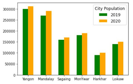
# Creating group bar chars (two bars)
fig, ax = plt.subplots(1,1, figsize = (8,6))
nnnz = Mydata7 ['City Population']
x = np.arange (len(nnnz))
#set a width for each bar
width = 0.3
A = ax.bar(x - width/2 , Mydata7[2019], width, label='2019',color='green')
B = ax.bar(x + width/2 , Mydata7[2020], width, label='2020',color= 'orange')
#set the ticks (This show site name in x axis)
ax.set_xticks(x)
ax.set_xticklabels(nnnz)
#add the legend #using the labels of the bars
ax.legend (title = "City Population",fontsize = 10,title_fontsize = 12)
#--------------------------------------------------------------------------
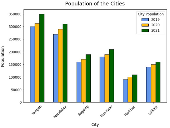
# Creating grouped bar charts (3 bars)
#create the base axis
fig, ax = plt.subplots(1,1, figsize = (9,6))
#set the label #and the x positions
label = Mydata7 ["City Population"]
x = np.arange(len(label))
#set the width of the bars
width = 0.2
#create the first bar -1 width
rect1 = ax.bar (x - width, Mydata7 [2019], width = width, label = 2019, edgecolor = "black", color ='#6495ED')
#create the second bar using x
rect2 = ax.bar (x , Mydata7 [2020] , width = width , label = 2020 , edgecolor = "black", color= '#FFB90F')
#create the third bar plus 1 width
rect3 = ax.bar (x + width , Mydata7 [2021] , width = width , label = 2021 , edgecolor = "black", color='#006400')
#add the labels to the axis
ax.set_ylabel ("Population", fontsize = 14, labelpad = 12)
ax.set_xlabel ("City", fontsize = 14, labelpad =12)
ax.set_title("Population of the Cities",fontsize = 18,pad = 12)
#set the ticks #using the labels
ax.set_xticks(x)
ax.set_xticklabels(label)
#add the legend
ax.legend(title = "City Population", fontsize = 12,title_fontsize = 12,bbox_to_anchor = (1.0, 1))
#adjust the tick paramaters
ax.tick_params(axis = "x",which = "both",labelrotation = 45,labelsize = 12)
ax.tick_params(axis = "y",which = "both",labelsize = 12)
#----------------------------------------------
# Adding text label in each bar
# This code need to put below after creating bar charts
for bar in ax.patches:
# The text annotation for each bar should be its height.
bar_value = bar.get_height()
# Format the text with commas to separate thousands. You can do
# any type of formatting here though.
text = f'{bar_value:,}'
# This will give the middle of each bar on the x-axis.
text_x = bar.get_x() + bar.get_width() / 2
# get_y() is where the bar starts so we add the height to it.
text_y = bar.get_y() + bar_value
# If we want the text to be the same color as the bar, we can
# get the color like so:
bar_color = bar.get_facecolor()
# If you want a consistent color, you can just set it as a constant, e.g. #222222
ax.text (text_x, text_y, text, ha='center', va='bottom', color=bar_color, size=10)

Source data table :
City Population | 2019 | 2020 | 2021 |
Yangon | 300,000 | 312,000 | 350,000 |
Mandalay | 270,000 | 290,000 | 310,000 |
Sagaing | 160,000 | 170,000 | 190,000 |
MonYwar | 180,000 | 190,000 | 210,000 |
Harkhar | 90,000 | 100,000 | 110,000 |
Loikaw | 140,000 | 150,000 | 160,000 |
👍👍👍👍👍
ReplyDeleteThis comment has been removed by the author.
ReplyDelete